
If gothic architecture gives us the silhouette of mystery, then gothic lettering gives us its voice. From the heavy strokes of Blackletter type to the delicate curves of Victorian flourishes, fonts have always been integral to conveying the Gothic aesthetic. We feel it every time we walk past a pub sign with ornate script, see a perfume bottle embossed with curling letters, or open a book whose title is framed in dark, dramatic typography.
Gothic fonts are not simply words; they are moods. They signal elegance, depth, and aesthetic before a single sentence is read. In the modern world, where branding depends heavily on instant recognition, gothic lettering remains one of the most effective ways to evoke a sense of tradition, mystery, and richness.
The History of Gothic Letterforms
The roots of gothic lettering lie in the Middle Ages, when scribes used Blackletter script in illuminated manuscripts. Its dense vertical strokes and ornate shapes made words look like architecture—columns and arches of ink. When paired with gold leaf, vines, and decorated capitals, Blackletter transformed reading into an aesthetic experience.
By the 19th century, Victorians revived and reinterpreted these letterforms in their design culture. Posters, advertisements, and signage used gothic-inspired typefaces to suggest refinement and drama. Pairing ornate letters with floral borders and elaborate layouts, they created text that was as decorative as the images surrounding it.
This tradition endures. Today, when we see gothic fonts, we associate them with aesthetic, depth, and timelessness. They carry with them the weight of centuries.

Lettering as an Aesthetic
Typography shapes how we feel about words before we even read them. A bold sans serif suggests modernity and clarity. A whimsical script suggests playfulness. A Gothic font suggests richness, ritual, and elegance.
Consider the way a candle company might brand itself with curling gothic letters on its labels, or how a gothic novel’s cover nearly always uses serifed, shadowed fonts. These choices are not accidental. They are designed to make the consumer feel that the product carries with it a mood: a shadow, a history, an intimacy.
In this way, lettering functions like architecture. Just as a gothic cathedral makes a person feel small, awed, and contemplative, a gothic font makes the reader think that the text itself has weight and gravity.
Branding with Flourishes
Modern branding often borrows from gothic typography to add drama and luxury. Perfumes, luxury fashion houses, and artisan goods frequently employ ornate fonts. Even mainstream products lean on gothic flourishes in autumn, when seasonal packaging turns to deep tones, serifed fonts, and curling lines to suggest coziness and aesthetic.
Gothic fonts also dominate in music branding, particularly for bands seeking to convey depth, darkness, or rebellion. However, even outside of heavy metal or gothic subcultures, gothic lettering has spread widely, appearing on Halloween packaging, artisanal beer bottles, wedding invitations, stationery, and book cover designs. The aesthetic power of flourishes and dark serifs crosses boundaries because it is instantly recognizable.
Digital Gothic Fonts
In the digital era, gothic fonts flourish on platforms like Instagram and TikTok. Creators use gothic-style typefaces in graphics, overlays, and even profile branding to convey a specific mood. Pinterest boards labelled with gothic fonts instantly read as an aesthetic; TikTok videos that include gothic script captions carry visual weight, making them feel slower and more intentional.
There has also been a revival of “retro” Victorian typography in digital design. Font libraries now include ornate serifs, flourished capitals, and Blackletter-inspired designs that creators use for mood boards, zines, and personal branding. Even memes sometimes use Gothic fonts to create contrast between the seriousness of the form and the lightness of the content.
Why Gothic Lettering Endures
What makes gothic fonts enduring is their ability to transform language into an aesthetic. They remind us that words can be seen as well as read, that letters can carry mood before they carry meaning.
In branding, they allow companies to align themselves with elegance, tradition, and coziness. In personal aesthetics, they allow creators to signal mood and identity at a glance. And in everyday life, they connect us to the centuries-old tradition of treating text as art, a ritual in itself.
Choosing a Gothic font is to say: this is not ordinary. It is a declaration of aesthetic, a way of surrounding language with shadow and light. In this way, lettering becomes part of the gothic tradition—not just communication, but enchantment.
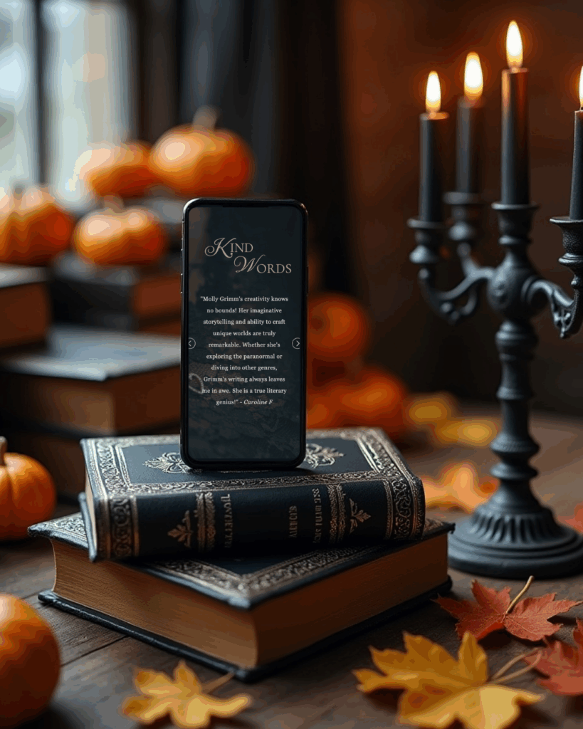
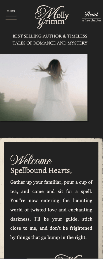
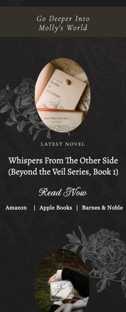
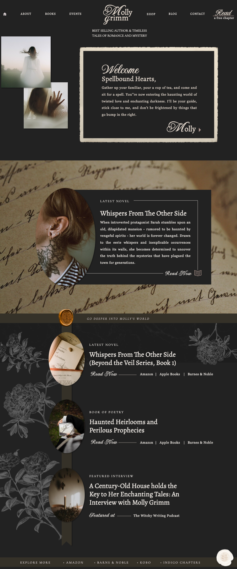
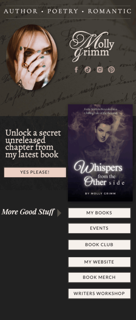
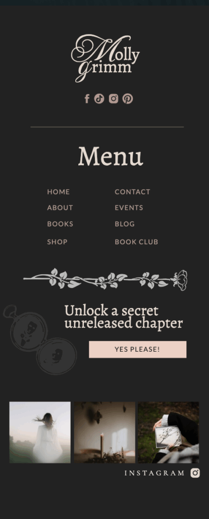
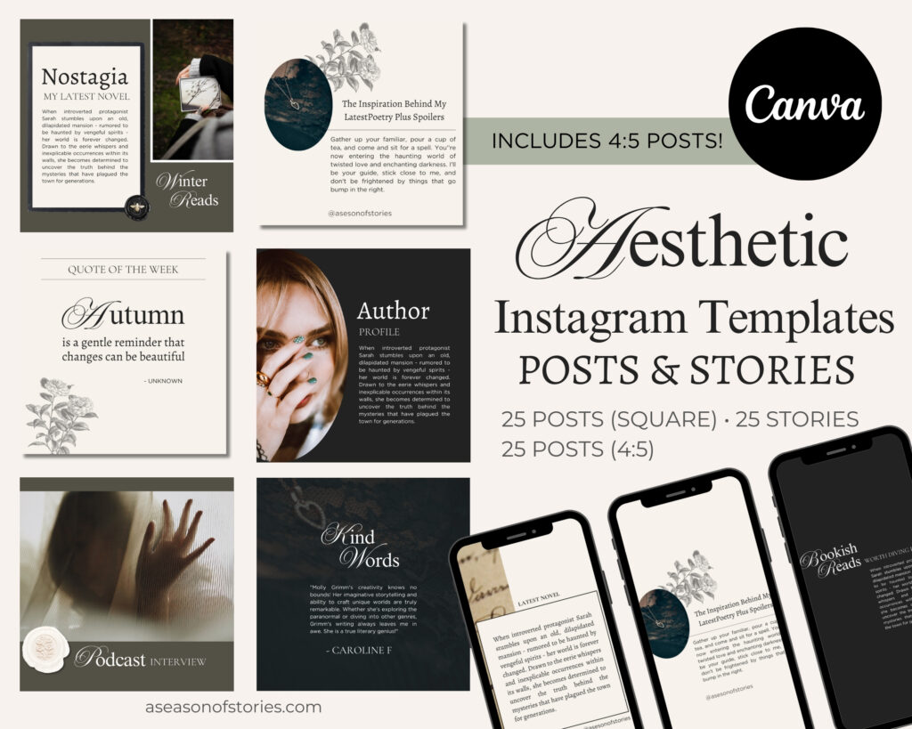
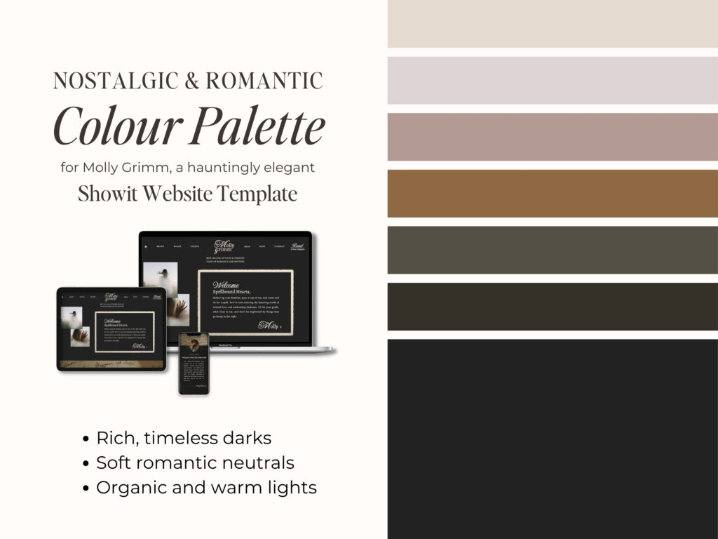
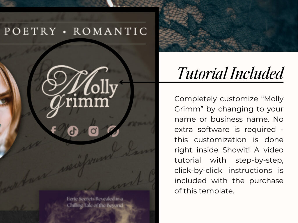
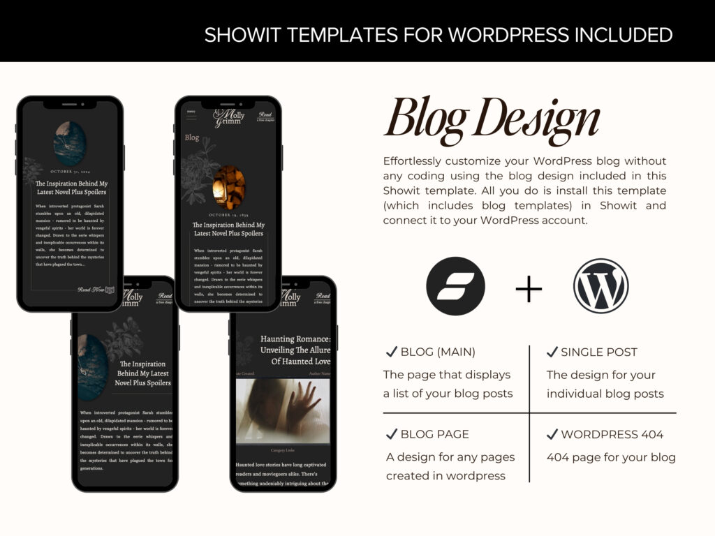
If gothic lettering has inspired you to rethink your own branding, I’ve created tools that bring these flourishes to life online. The Molly Grimm Dark Academia Showit Template captures the moody elegance of Victorian typography in a fully customizable author website. And for social media, my Instagram templates for Canva feature Victorian-inspired fonts designed to make your posts feel timeless
Explore the Showit Template | Shop the Canva Pack | Browse The Shop


